CONVERSION JOURNEY: TURNING SCROLLERS INTO DAILY USERS
Into the Funnel
In today’s competitive digital landscape, the user experience begins the moment someone notices your product—often through a digital ad. Whether signing up for a newsletter, downloading an app, or making a purchase, every step after clicking an ad impacts conversion rates.
As a Senior UX Designer at SVI, I saw an opportunity to optimize our top-funnel digital ads, refining the user journey to boost engagement and conversions. We identified key drop-off points and systematically enhanced the experience, ensuring users seamlessly progressed through each step—ultimately turning them into leads.
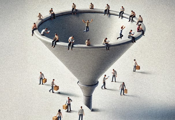
The Problem: Leaky Pipes
In digital marketing, user journeys are like pipes in a funnel. At the top, you aim to capture as many users as possible. But if the pipes are leaky—due to confusing flows, disjointed transitions, or inconsistent messaging—users will drop off before reaching the bottom. The challenge?
Short attention spans
Fragmented transitions between platforms
Lack of consistency in messaging and experience
A broken pipe causes leaks, and in a user journey, that means lost potential customers. If the experience feels disjointed, users won’t just drop off—they’ll be gone for good.

The Solution: Fixing the Leaks
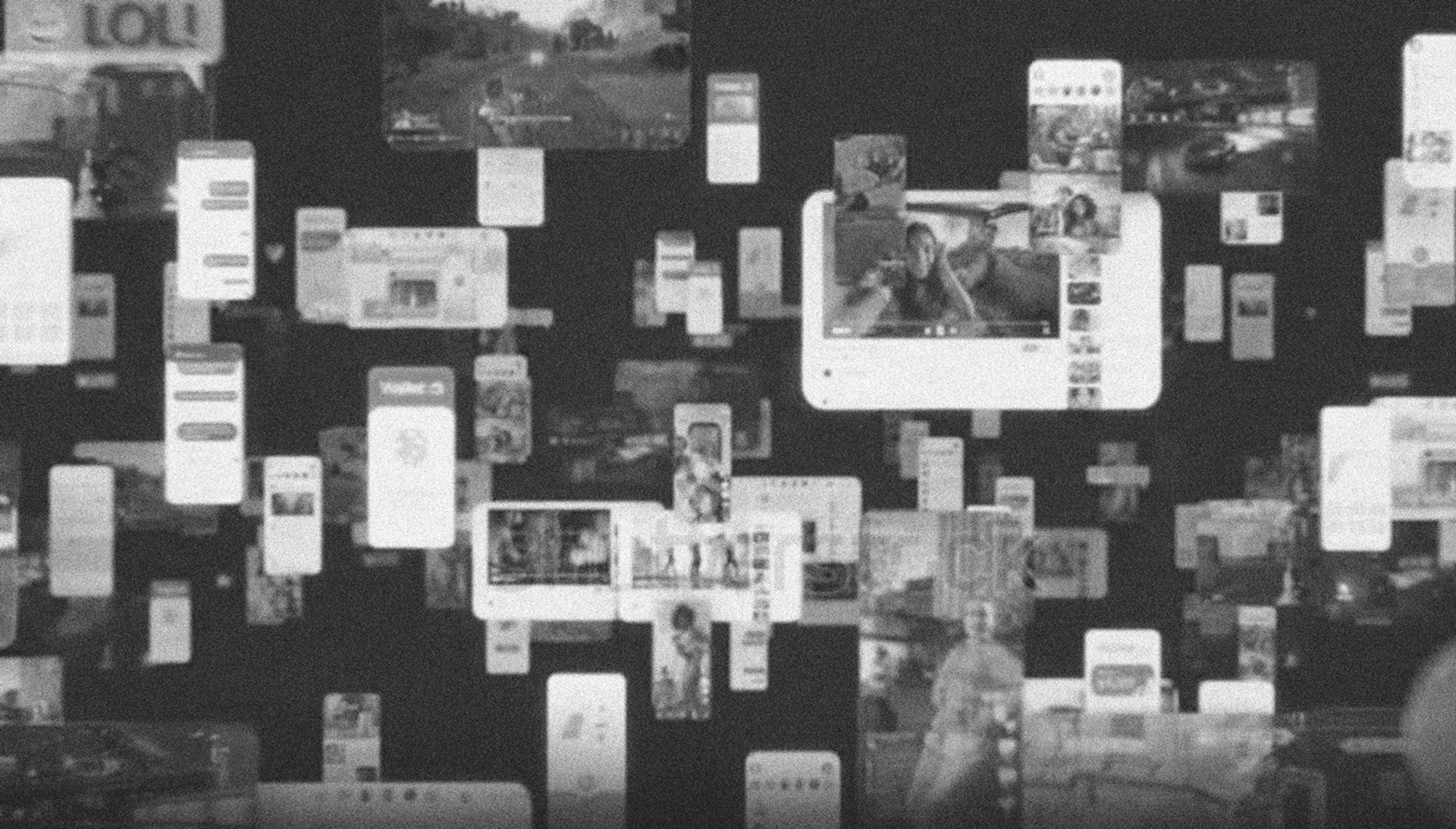
1. The Top of the Funnel: Capturing Attention
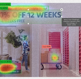
Leveraged attention insights to predict where users would look while scrolling, placing strategic hooks in high-impact areas.
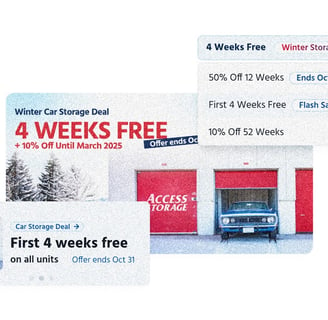
A/B tested various ad sizes, visuals, and copy to maximize clarity and engagement across placements.
Implemented hyper-personalization, tailoring ads based on user demographics like location, budget, and behavior—resulting in up to 90 ad variations per creative for maximum relevance.
2. Connecting the Pipes: Seamless Transitions
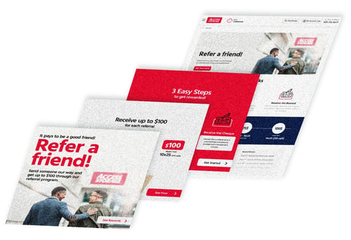
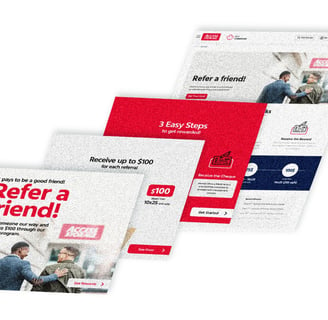
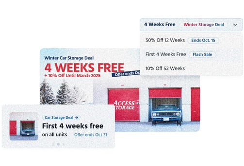
Ensured the landing page matched the ad’s promise, maintaining consistency in visuals, messaging, and tone to prevent drop-offs.
Predicted user intent: If they clicked on a promo ad, they saw highlighted savings. Or if they engaged with a community event ad, the landing page emphasized event details.
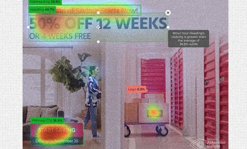
3. The Bottom of the Funnel: Sealing the Deal
Designed product/service pages that felt like a natural extension of the ad and landing page, eliminating friction in the user journey.
Used heatmaps and user testing to identify pain points, refining layouts to reduce drop-offs.
The Results: A Seamless Flow
By fixing leaks in the funnel, we achieved measurable improvements:
Higher CTR: More engaging ads drove increased clicks.
Less Bounce Rate: Optimized product pages encouraged users to stay engaged.
Improved Conversions: Landing pages that matched user expectations led to more sign-ups and purchases.
The UX Advantage
As a Senior UX Designer, my work extends beyond screens—I design flows. My experience optimizing digital ad funnels has sharpened my ability to capture attention, predict user behaviour, and create seamless multi-platform transitions. Whether it’s an ad, a landing page, or a full product experience, I ensure every touchpoint is connected, consistent, and high-converting.
Ready to design high-converting experiences that keep users engaged from first click to final action? Let’s build a funnel that drives results.